franz + partner
A new brand for construction experts
Task:
- Brand development: wordmark, design mark, office equipment, web design
Realisation:
franz + partner rechtsanwälte is a newly founded law firm that specialises in construction and architectural law, real estate and public procurement law and advises above all medium-sized construction companies. In exchange with the client, the agency worked out the self-image of the firm. The special characteristics of the middle class play a central role here: authentic, down-to-earth, reliable, correct and personal. At the same time, they are dynamic, innovative, different and rethinking.
In the further course of the branding, it became clear that the lawyers do not see themselves as classical representatives, but rather as modern interpreters of their profession. They think differently, they rethink, they think outside the box. They are agile and flexible and can therefore adapt quickly and easily to changing requirements at any time.
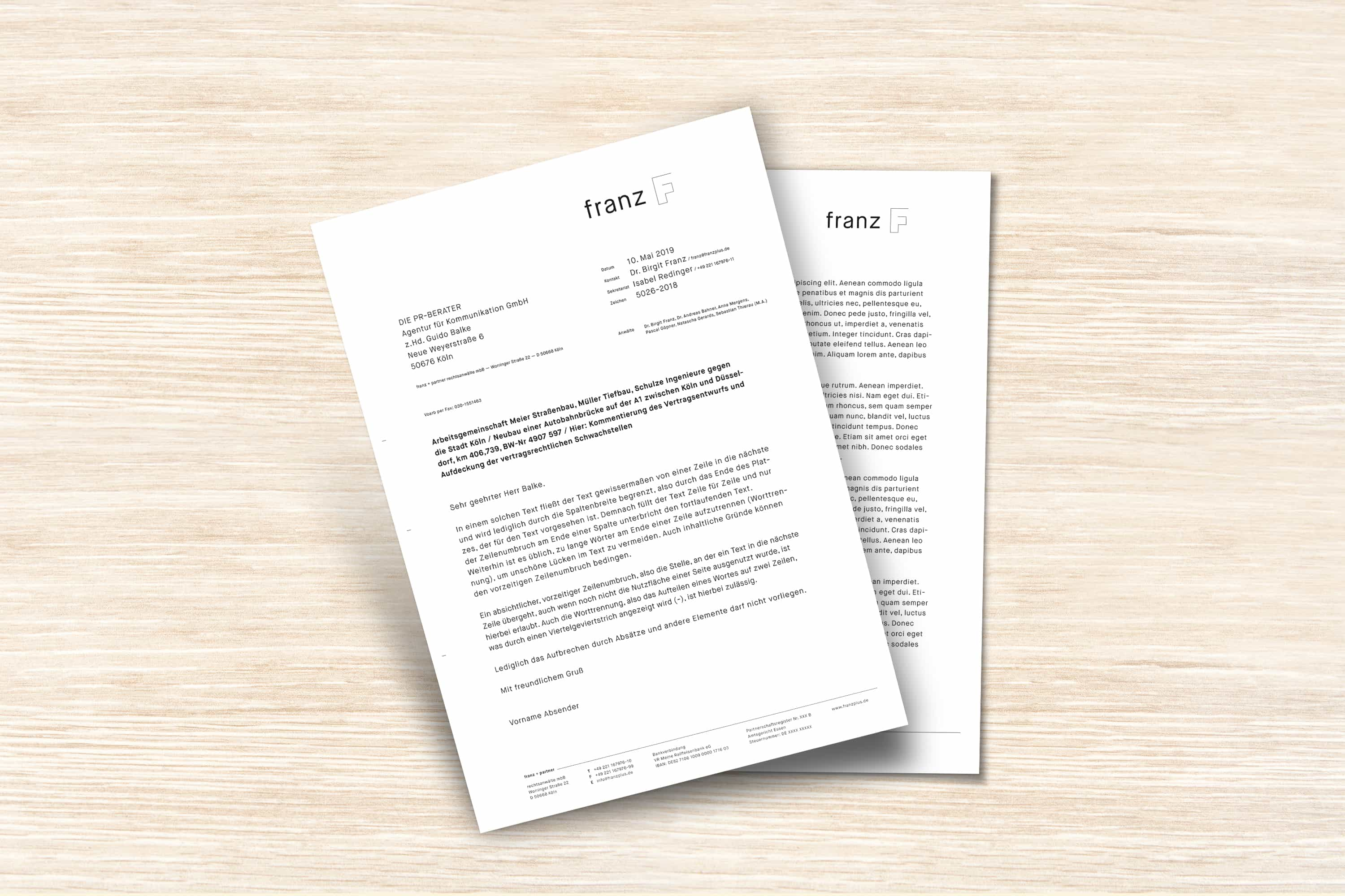
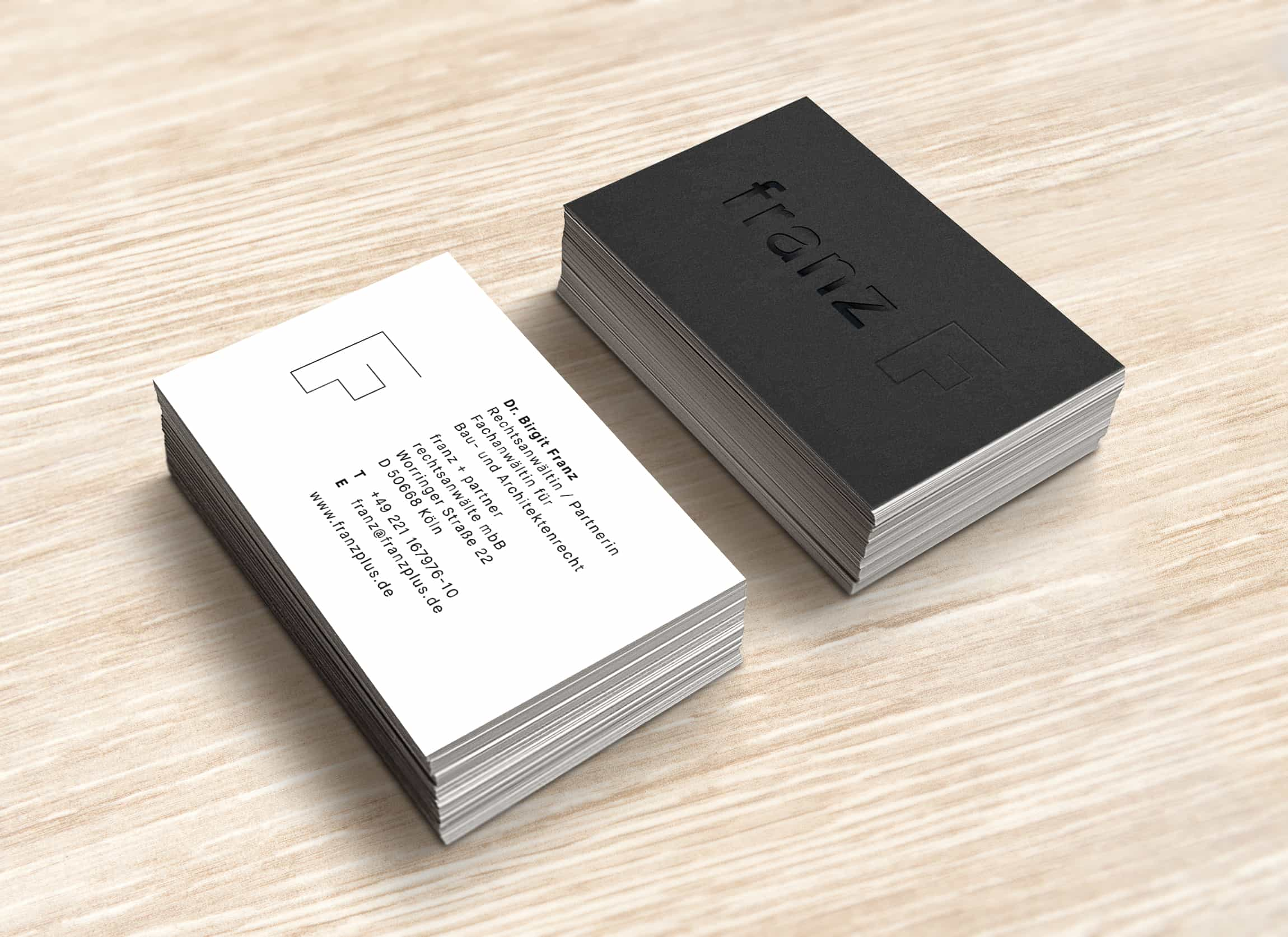
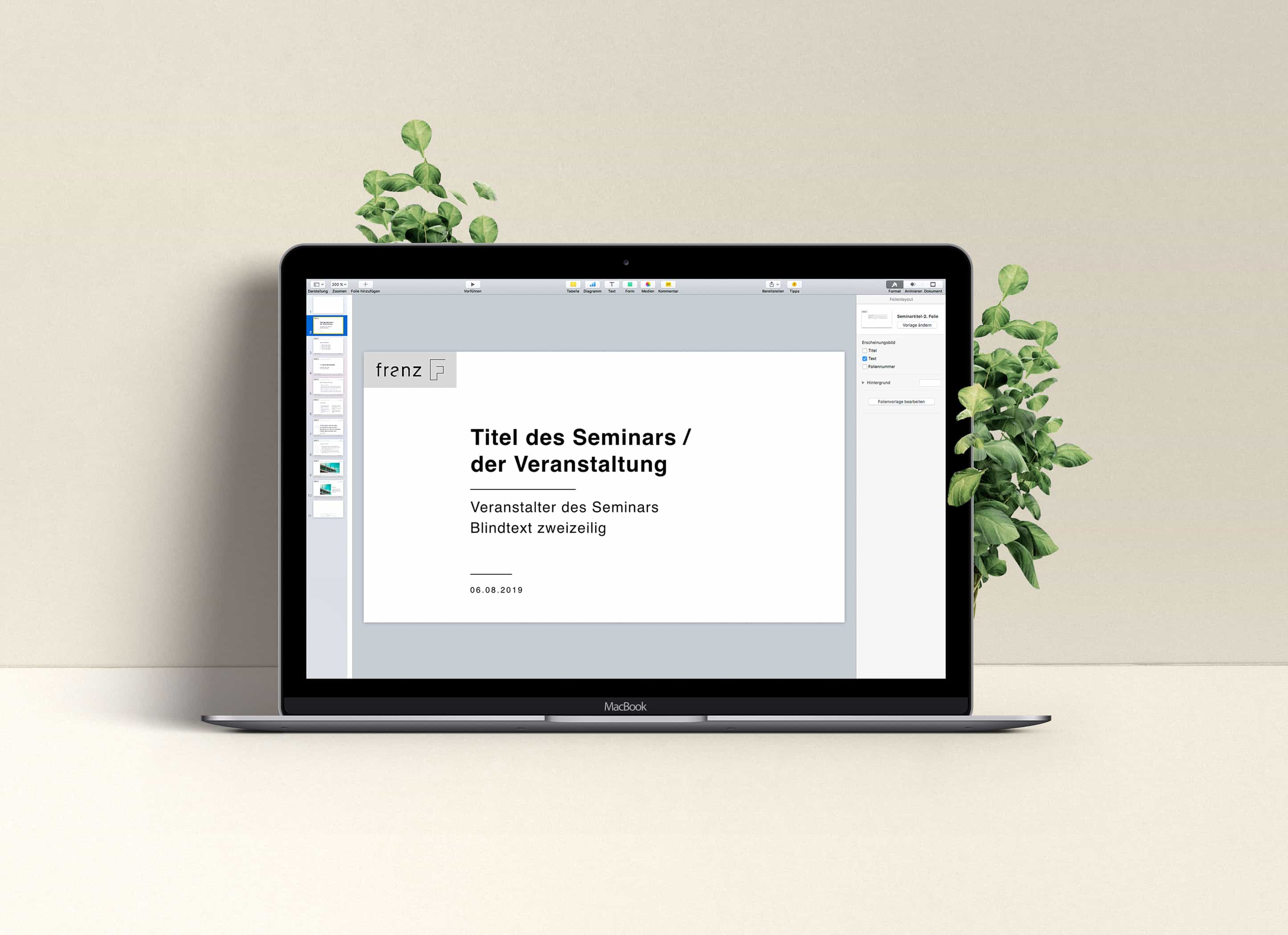
The demand on the new brand was correspondingly high, representing all peculiarities and qualities and ensuring differentiation. Just as the lawyers take a back seat and focus on the client's business, the agency designed a wordmark that does exactly this: concentrating on the essentials. Simple, straightforward, effective.
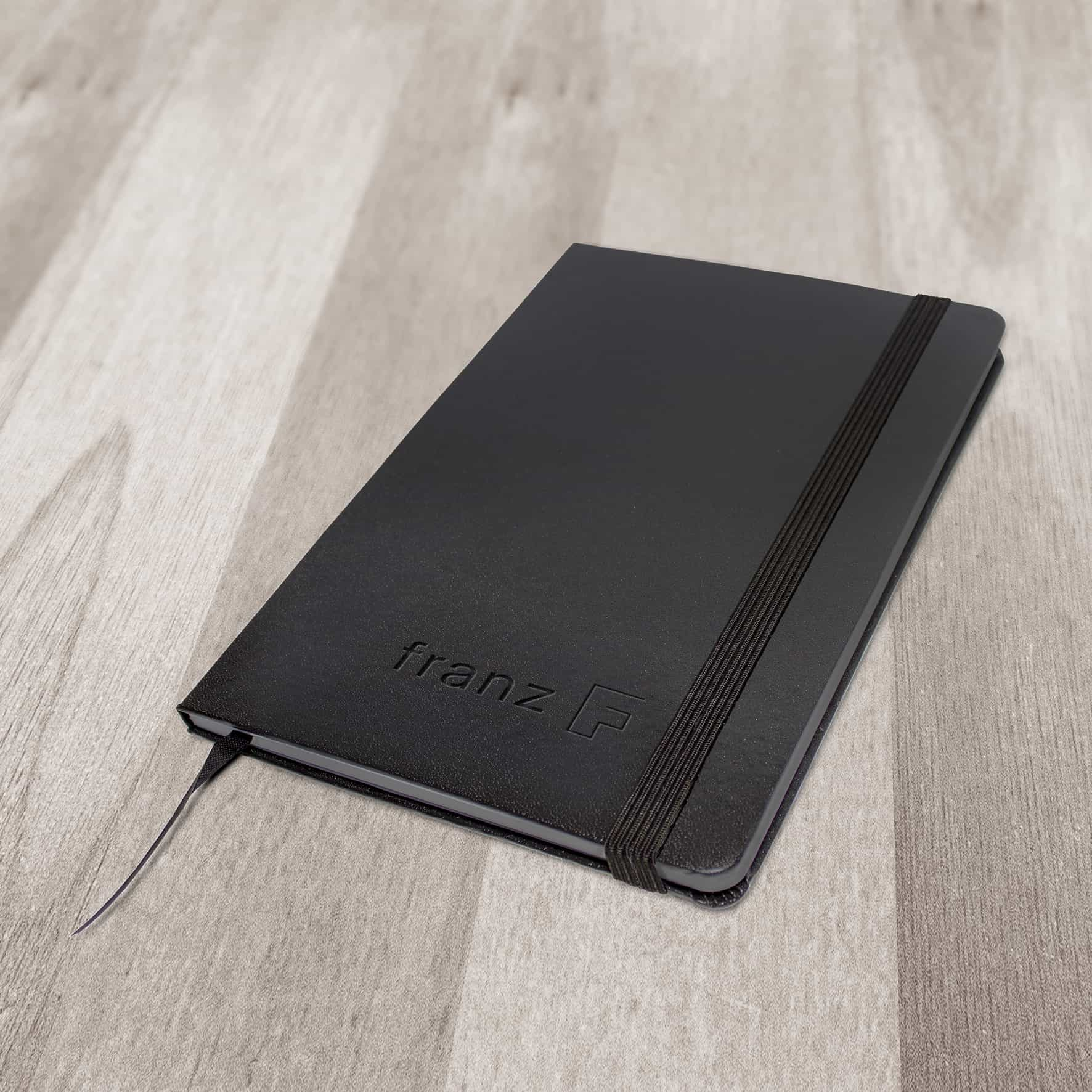
The name of the founder and partner forms the simple wordmark. It is deliberately written in small letters. The icon, the "F", the initial letter of the name, creates reference to the topics building and architecture. The other design products take up this straightforwardness and complement it with emotion and personality. The imagery shows the attorneys open minded and approachable in the office and on the building site, in conversation with clients. The abstract legal service literally receives a face and becomes tangible.
A new brand for construction experts
Task:
- Brand development: wordmark, design mark, office equipment, web design
Realisation:
franz + partner rechtsanwälte is a newly founded law firm that specialises in construction and architectural law, real estate and public procurement law and advises above all medium-sized construction companies. In exchange with the client, the agency worked out the self-image of the firm. The special characteristics of the middle class play a central role here: authentic, down-to-earth, reliable, correct and personal. At the same time, they are dynamic, innovative, different and rethinking.
In the further course of the branding, it became clear that the lawyers do not see themselves as classical representatives, but rather as modern interpreters of their profession. They think differently, they rethink, they think outside the box. They are agile and flexible and can therefore adapt quickly and easily to changing requirements at any time.
The demand on the new brand was correspondingly high, representing all peculiarities and qualities and ensuring differentiation. Just as the lawyers take a back seat and focus on the client's business, the agency designed a wordmark that does exactly this: concentrating on the essentials. Simple, straightforward, effective.
The name of the founder and partner forms the simple wordmark. It is deliberately written in small letters. The icon, the "F", the initial letter of the name, creates reference to the topics building and architecture. The other design products take up this straightforwardness and complement it with emotion and personality. The imagery shows the attorneys open minded and approachable in the office and on the building site, in conversation with clients. The abstract legal service literally receives a face and becomes tangible.
Lawyers or Designers?
Task:
- Development of a new web presence in regards to the founding of franz + partner rechtsanwälte
Realisation:
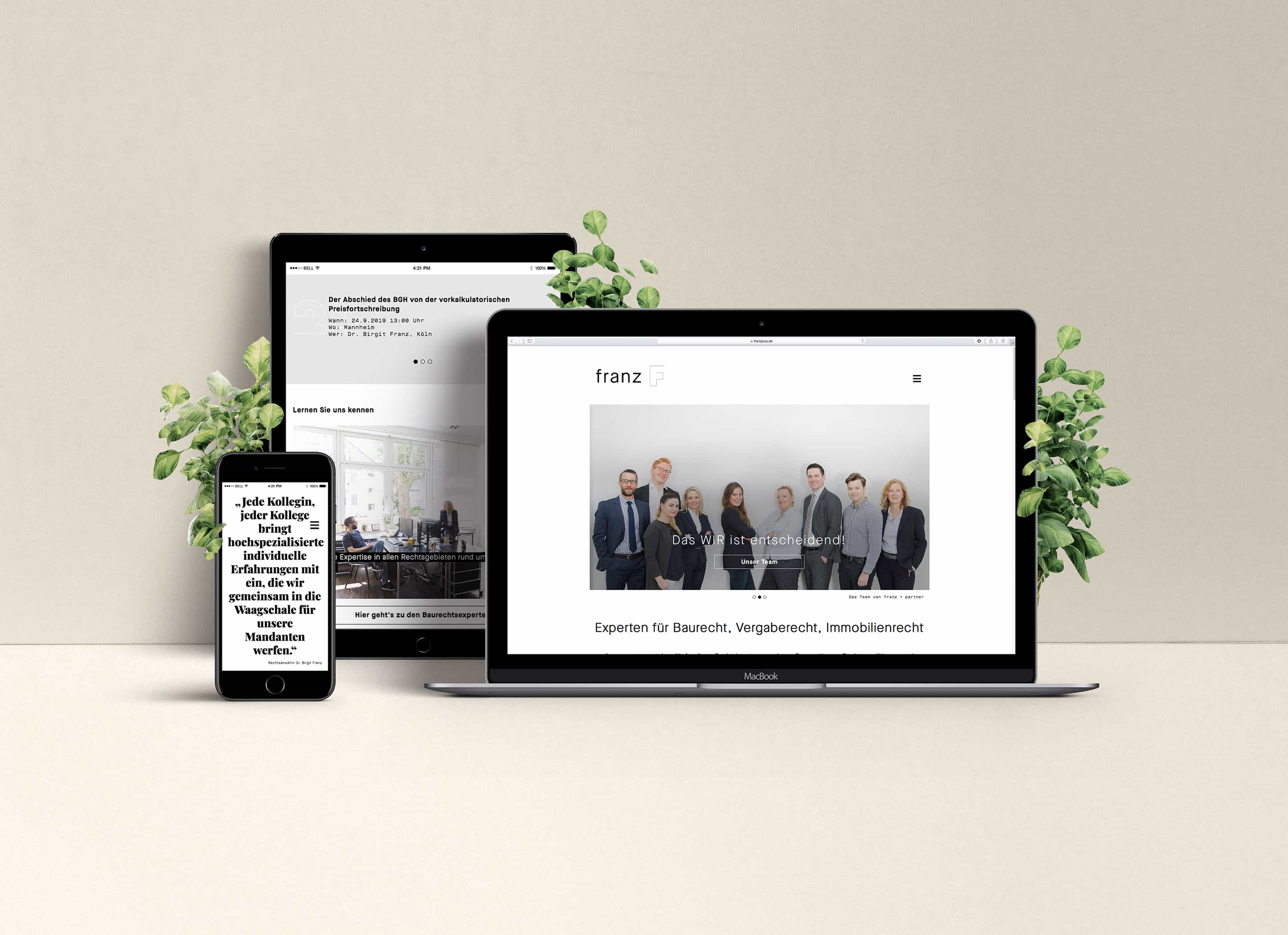
DIE PR-BERATER developed a website that expresses the positioning of the firm: modern, innovative and at the same time down-to-earth, authentic and genuine. The design is reduced and gives a lot of space for pictures and typography. The photos of the characters occupy a large space. The page conveys trust, security and competence. The impression is serious, but not elitist. Rather, expertise meets personality and forms the framework for perfect legal advice.
The design supports the content in a calm and concentrated manner. Essential for the content of the site are the services of the law firm, also from the point of view of search engines, which potential clients use to search for required services. The competences of the law firm are presented in a compact and on-point-manner.
The technology had to match the firm's innovative approach. Therefore, the Open Source CMS Wagtail was used here. It is easy to understand, attractively designed and focuses on the essentials. In addition, it offers optimal integration possibilities into existing systems. This is particularly important for the implementation of later versions of the website, when it comes to creating a login area or connecting office software.